[av_heading heading=’Modul 3 – Lektion 16
Ein paar Regeln zum brechen‚ tag=’h1′ link_apply=“ link=’manually,http://‘ link_target=“ style=’blockquote modern-quote modern-centered‘ size=“ subheading_active=’subheading_below‘ subheading_size=’16‘ margin=“ padding=’20‘ color=“ custom_font=“ custom_class=“ admin_preview_bg=“ av-desktop-hide=“ av-medium-hide=“ av-small-hide=“ av-mini-hide=“ av-medium-font-size-title=“ av-small-font-size-title=“ av-mini-font-size-title=“ av-medium-font-size=“ av-small-font-size=“ av-mini-font-size=“]
Teil 1:
[/av_heading]
[av_hr class=’invisible‘ height=’70‘ shadow=’no-shadow‘ position=’center‘ custom_border=’av-border-thin‘ custom_width=’50px‘ custom_border_color=“ custom_margin_top=’30px‘ custom_margin_bottom=’30px‘ icon_select=’yes‘ custom_icon_color=“ icon=’ue808′ font=’entypo-fontello‘ av_uid=’av-6yofkp‘ admin_preview_bg=“]
[av_textblock size=“ font_color=“ color=“ av-medium-font-size=“ av-small-font-size=“ av-mini-font-size=“ av_uid=’av-6t20jd‘ admin_preview_bg=“]
Wer als Anfänger die Gestaltungsregeln der Fotografie ignoriert, hat keinen Verstand. Wer sich aber fotolebenslang daran klammert, hat keine Phantasie.
Detlev Motz
[/av_textblock]
[av_hr class=’invisible‘ height=’50‘ shadow=’no-shadow‘ position=’center‘ custom_border=’av-border-thin‘ custom_width=’50px‘ custom_border_color=“ custom_margin_top=’30px‘ custom_margin_bottom=’30px‘ icon_select=’yes‘ custom_icon_color=“ icon=’ue808′ font=’entypo-fontello‘ av_uid=’av-6yofkp‘ admin_preview_bg=“]
[av_textblock size=“ font_color=“ color=“ av-medium-font-size=“ av-small-font-size=“ av-mini-font-size=“ av_uid=’av-6t20jd‘ admin_preview_bg=“]
In dieser Lektion lernst du…
- …was die verschiedenen Bildformate auszeichnet.
- …wie sich Perspektive und Brennweite auswirken.
- …was positiver und negativer Raum ist.
- …die Bedeutung der Tonwerte.
Ziel eines jeden Fotografen, egal ob Hobby- oder Profi-Künstler, ist es, mit seinen Bildern etwas zum Ausdruck zu bringen, bzw. die Bilder sprechen zu lassen. In der Fotographie gibt es zahlreiche Möglichkeiten, in dieser Hinsicht Einfluss auf ein entstehendes Foto zu nehmen. Die größte Rolle spielen dabei natürlich Licht und Schatten. Daneben gibt es jedoch noch eine ganze Menge weiterer Elemente, die du nutzen kannst um deinen Fotos mehr Ausdruck zu verleihen.
Dein Foto sollte nicht nur schön aussehen, sondern vom Betrachter auch verstanden werden und ihn emotional ansprechen.
Aus diesem Grund ist es zwar wichtig ein Motiv zu erkennen, die eigentliche Herausforderung besteht jedoch darin, ein Motiv auch in Szene setzen zu können:
[/av_textblock]
[av_hr class=’invisible‘ height=’70‘ shadow=’no-shadow‘ position=’center‘ custom_border=’av-border-thin‘ custom_width=’50px‘ custom_border_color=“ custom_margin_top=’30px‘ custom_margin_bottom=’30px‘ icon_select=’yes‘ custom_icon_color=“ icon=’ue808′ font=’entypo-fontello‘ av_uid=’av-6rta75′ admin_preview_bg=“]
[av_one_full first min_height=“ vertical_alignment=’av-align-top‘ space=“ margin=’0px‘ margin_sync=’true‘ padding=’0px,0px,20px,0px‘ border=“ border_color=“ radius=’0px‘ radius_sync=’true‘ background_color=“ src=“ attachment=“ attachment_size=“ background_position=’top left‘ background_repeat=’no-repeat‘ animation=“ mobile_breaking=“ mobile_display=“ av_uid=’av-6j2c8h‘]
[av_textblock size=“ font_color=“ color=“ av-medium-font-size=“ av-small-font-size=“ av-mini-font-size=“ av_uid=’av-6d2agh‘ admin_preview_bg=“]
Bildformate:
[/av_textblock]
[av_hr class=’invisible‘ height=’10‘ shadow=’no-shadow‘ position=’center‘ custom_border=’av-border-thin‘ custom_width=’50px‘ custom_border_color=“ custom_margin_top=’30px‘ custom_margin_bottom=’30px‘ icon_select=’yes‘ custom_icon_color=“ icon=’ue808′ font=’entypo-fontello‘ admin_preview_bg=“ av_uid=’av-65g089′]
[av_textblock size=“ font_color=“ color=“ av-medium-font-size=“ av-small-font-size=“ av-mini-font-size=“ av_uid=’av-5z8v1t‘ admin_preview_bg=“]
Hochformat, Querformat, oder doch im Quadrat? Die meisten Anfänger neigen dazu, alle ihre Bilder im Querformat abzulichten, was sich, je nach Motiv, schon negativ auf die Wirkung niederschlagen kann. Hier hilft meist schon ein kurzes Nachdenken bzw. ein kurzes Auseinandersetzen mit dem Motiv, um eine erste richtige Entscheidung zu treffen.
Bei Unsicherheit bietet es sich an, ein Foto in beiden Richtungen abzulichten und die Nachbearbeitung zu nutzen um evtl. störende Elemente abzuschneiden oder das Format geradezurücken.
Querformat
Die englische Bezeichnung für das Querformat sagt bereits einiges aus. „Landscape“ steht für Landschaft und bringt somit gleich den hauptsächlichen Verwendungszweck zum Ausdruck:
Das Querformat kommt der Wahrnehmung des menschlichen Auges am nächsten.
Um einem Foto im Querformat zu Dynamik oder Dramatik zu verhelfen bedarf es einiger Anstrengung, da die meisten Bilder in sich ruhig und stabil die Waagerechte hervorheben.
Hochformat
Auch hier gibt der englische Begriff „Portrait“ den Hauptverwendungszweck wieder:
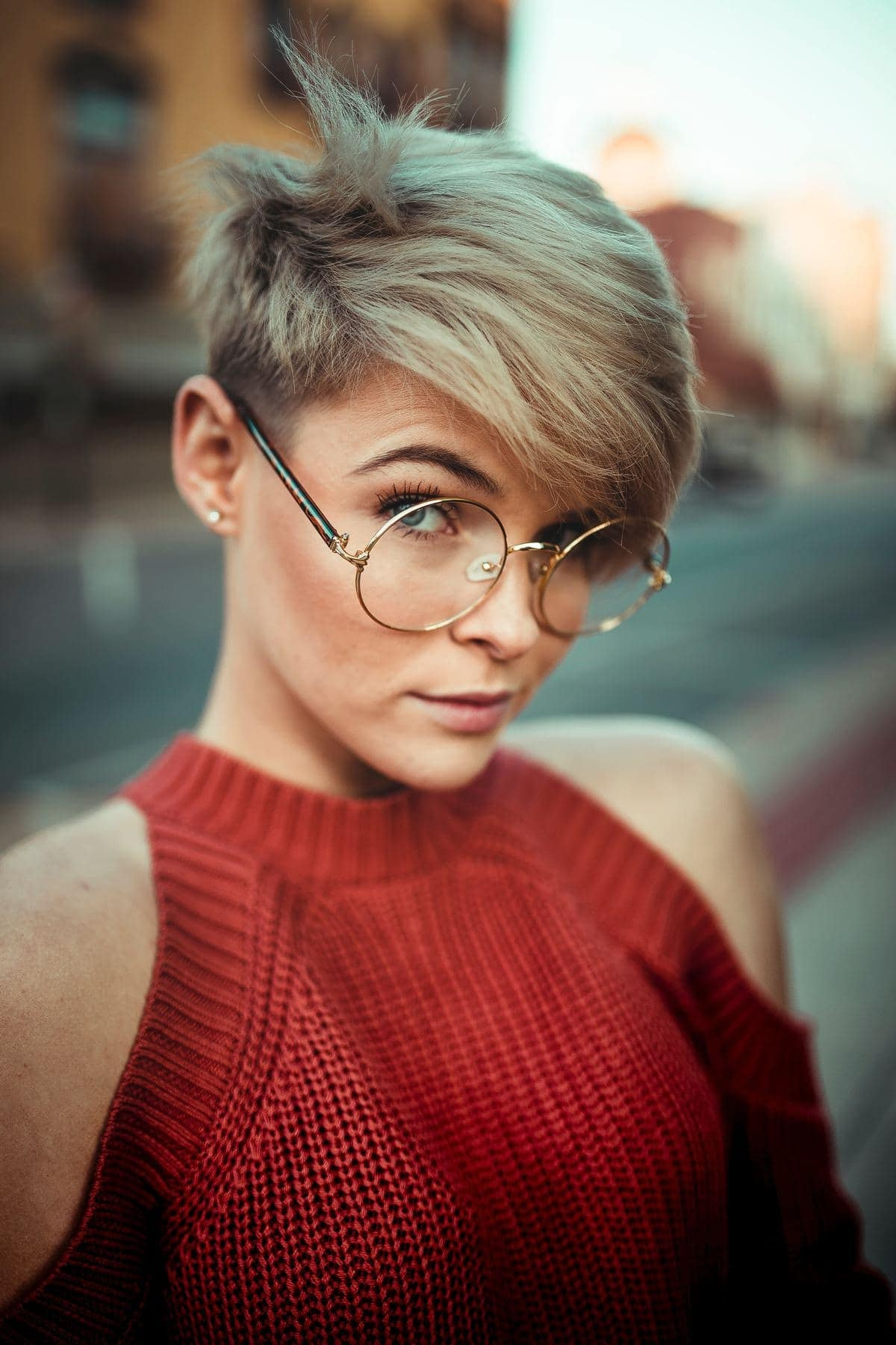
Mit dem Hochformat ist man näher dran, wodurch die Bilder ofmals mehr Dynamik und Lebendigkeit ausstrahlen.
Überprüfe dich einmal selbst in Bezug auf dein Kamera-Verhalten. Wenn dir dabei auffällt, dass du auch zu häufig das Querformat nutzt, zwinge dich zu mehr Aufnahmen im Hochformat. Die Anzeige im Display kann auch so eingestellt werden, dass sie nicht gedreht wird, sondern die gesamte Größe des Displays ausnutzt.
Quadrat
Im quadratischen Format lässt sich ein Motiv gut in Szene setzen, da an den Seiten sowie oben und unten keine Flächen gefüllt werden müssen. Generell wird das Quadrat als sachlich und neutral angesehen. Dabei ist jedoch zu beachten, dass der Spagat hin zu langweiligen Bildern nicht sehr groß ist.
Das quadratische Format bietet sehr viel Spielraum für Abstraktion.
[/av_textblock]
[/av_one_full]
[av_one_full first min_height=“ vertical_alignment=’av-align-top‘ space=“ margin=’0px‘ margin_sync=’true‘ padding=’0px,0px,20px,0px‘ border=“ border_color=“ radius=’0px‘ radius_sync=’true‘ background_color=“ src=“ attachment=“ attachment_size=“ background_position=’top left‘ background_repeat=’no-repeat‘ animation=“ mobile_breaking=“ mobile_display=“ av_uid=’av-6j2c8h‘]
[av_textblock size=“ font_color=“ color=“ av-medium-font-size=“ av-small-font-size=“ av-mini-font-size=“ av_uid=’av-6d2agh‘ admin_preview_bg=“]
Kameraposition und Perspektive:
[/av_textblock]
[av_hr class=’invisible‘ height=’10‘ shadow=’no-shadow‘ position=’center‘ custom_border=’av-border-thin‘ custom_width=’50px‘ custom_border_color=“ custom_margin_top=’30px‘ custom_margin_bottom=’30px‘ icon_select=’yes‘ custom_icon_color=“ icon=’ue808′ font=’entypo-fontello‘ admin_preview_bg=“ av_uid=’av-65g089′]
[av_textblock size=“ font_color=“ color=“ av-medium-font-size=“ av-small-font-size=“ av-mini-font-size=“ av_uid=’av-5z8v1t‘ admin_preview_bg=“]
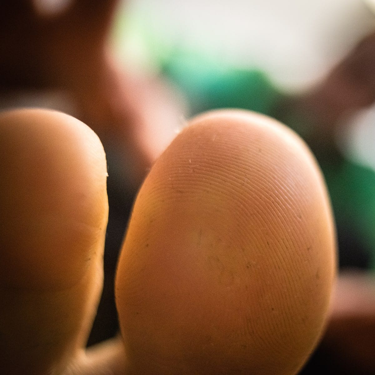
Die Position der Kamera kann entscheidend zum Gelingen eines Fotos beitragen und schon ein minimaler Wechsel des Standorts kann aus einem guten Bild ein sehr gutes Bild werden lassen.
Es reicht zum Beispiel oftmals schon aus, einfach mal in die Knie zu gehen oder sich hinzulegen, um eine ganz andere Sicht auf das Motiv zu erhalten. Ein guter Satz den einer meiner Fotografie-Proffesoren immer gebetsmühlenartig wiederholt hat war: „verlasse den Bühnenblick“.
Vielleicht ergeben sich aus anderer Perspektive als dem Bühnenblick ja ganz andere Möglichkeiten für ein außergewöhnliches Foto. Sei also auch mit der Kamera in der Hand beweglich und gib dich nicht mit dem erstbesten Blick auf dein Motiv zufrieden, es soll schließlich dein eigener Blick ausgedrückt werden und nicht der Standard-Blick aus Standard-Stativhöhe.
Verliere dabei aber auch nicht deine Umgebung aus den Augen! Es soll schon Leute gegeben haben, die sich auf der Suche nach der besten Position für ein Foto verletzt haben oder nasse Füße bekommen haben…damit meine ich natürlich nicht mich ;-)
Der Schlüssel zu außergewöhnlichen Fotografien liegt nicht selten in außergewöhnlichen Perspektiven:

[/av_textblock]
[/av_one_full]
[av_one_full first min_height=“ vertical_alignment=’av-align-top‘ space=“ margin=’0px‘ margin_sync=’true‘ padding=’0px,0px,20px,0px‘ border=“ border_color=“ radius=’0px‘ radius_sync=’true‘ background_color=“ src=“ attachment=“ attachment_size=“ background_position=’top left‘ background_repeat=’no-repeat‘ animation=“ mobile_breaking=“ mobile_display=“ av_uid=’av-6j2c8h‘]
[av_textblock size=“ font_color=“ color=“ av-medium-font-size=“ av-small-font-size=“ av-mini-font-size=“ av_uid=’av-6d2agh‘ admin_preview_bg=“]
Brennweiten und Bildausschnitte:
[/av_textblock]
[av_hr class=’invisible‘ height=’10‘ shadow=’no-shadow‘ position=’center‘ custom_border=’av-border-thin‘ custom_width=’50px‘ custom_border_color=“ custom_margin_top=’30px‘ custom_margin_bottom=’30px‘ icon_select=’yes‘ custom_icon_color=“ icon=’ue808′ font=’entypo-fontello‘ admin_preview_bg=“ av_uid=’av-65g089′]
[av_textblock size=“ font_color=“ color=“ av-medium-font-size=“ av-small-font-size=“ av-mini-font-size=“ av_uid=’av-5z8v1t‘ admin_preview_bg=“]
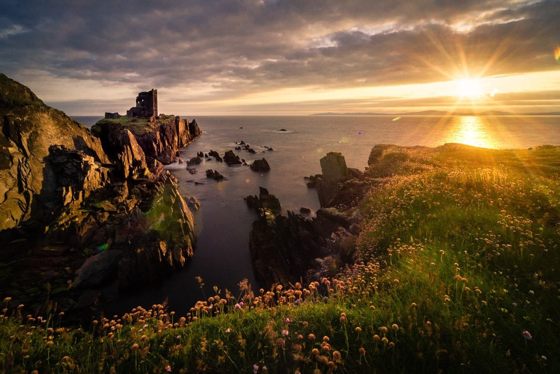
Neben der Positionierung deiner Kamera ist auch die Brennweite entscheidend für die Wirkung eines Fotos.
Je größer die Brennweite eines Objektivs, desto mehr wird dadurch der Raum komprimiert und Objekte erscheinen einander näher als das tatsächlich der Fall ist:
Mach dir diese Eigenschaft zum Freund indem du sie klug einsetzt, um spannende und ansprechende Bilder zu erzeugen.
Vom Bildausschnitt den du darstellen möchtest hängt die Auswahl deines Objektivs ab. Wenn die wichtigste Entscheidung erst einmal gefallen ist, nämlich was du auf deinem Foto aufnehmen möchtest, solltest du das Objektiv verwenden, das möglichst genau und ohne Überstände das abbildet was du dir vorstellst.
Auch wenn der Bildausschnitt natürlich im Nachhinein am PC noch angepasst werden kann, empfiehlt es sich dennoch, bereits beim Schießen des Fotos darauf zu achten, möglichst wenig Überschuss zu haben.
[/av_textblock]
[/av_one_full]
[av_one_full first min_height=“ vertical_alignment=’av-align-top‘ space=“ margin=’0px‘ margin_sync=’true‘ padding=’0px,0px,20px,0px‘ border=“ border_color=“ radius=’0px‘ radius_sync=’true‘ background_color=“ src=“ attachment=“ attachment_size=“ background_position=’top left‘ background_repeat=’no-repeat‘ animation=“ mobile_breaking=“ mobile_display=“ av_uid=’av-6j2c8h‘]
[av_textblock size=“ font_color=“ color=“ av-medium-font-size=“ av-small-font-size=“ av-mini-font-size=“ av_uid=’av-6d2agh‘ admin_preview_bg=“]
Positiver und negativer Raum:
[/av_textblock]
[av_hr class=’invisible‘ height=’10‘ shadow=’no-shadow‘ position=’center‘ custom_border=’av-border-thin‘ custom_width=’50px‘ custom_border_color=“ custom_margin_top=’30px‘ custom_margin_bottom=’30px‘ icon_select=’yes‘ custom_icon_color=“ icon=’ue808′ font=’entypo-fontello‘ admin_preview_bg=“ av_uid=’av-65g089′]
[av_textblock size=“ font_color=“ color=“ av-medium-font-size=“ av-small-font-size=“ av-mini-font-size=“ av_uid=’av-5z8v1t‘ admin_preview_bg=“]
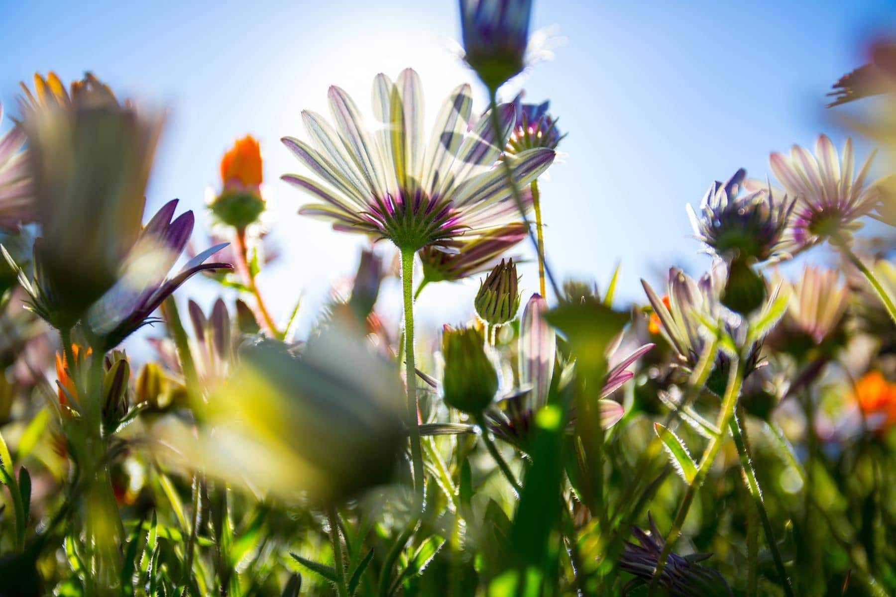
Einfach gesprochen sind helle und dunkle Bereiche auf einem Foto bzw. bei der Betrachtung eines Motivs gemeint, wenn von positivem bzw. negativem Raum die Rede ist. Betrachtet man zum Beispiel einen Fluss, so sind Steine die aus dem Wasser ragen der positive Raum während das fließende Wasser den negativen Raum darstellt:
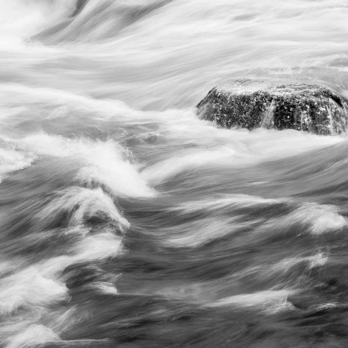
Für die Qualität eines Bildes sind hier vor allem die Wechselwirkungen zwischen positivem und negativem Raum entscheidend.
Wie ist das Verhältnis zwischen positivem und negativem Raum? Ist es ausgewogen? Achtung: hier ist nicht gemeint dass ein Bild zu jeweils der Hälfte hell und dunkel sein sollte. Hierbei geht es darum, wie helle und dunkle Bereiche von Bildkante zu Bildkante zusammenspielen.
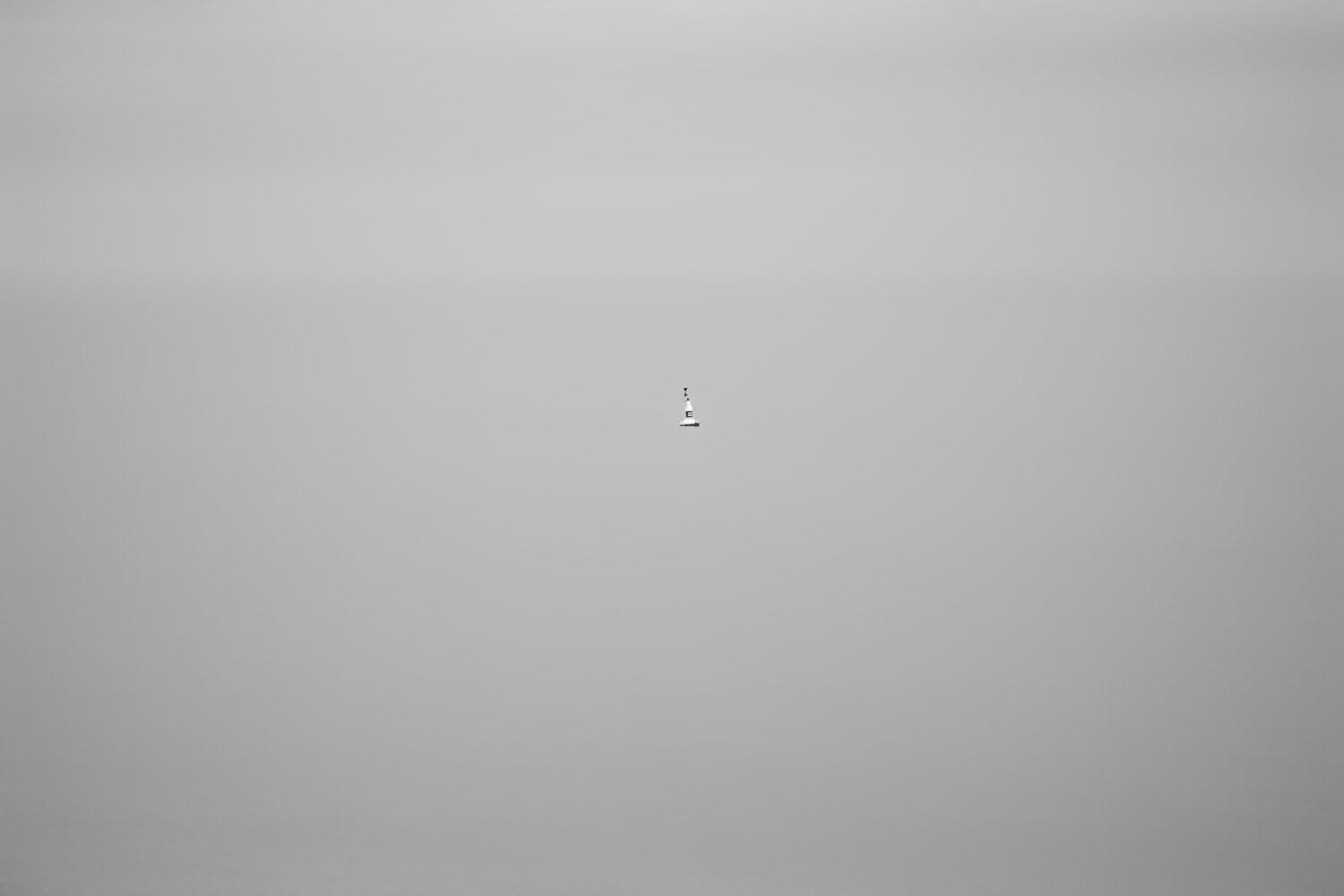
Du kannst negativen und positiven Raum sehr kreativ einsetzen.
Indem du beispielsweise ein Element mit viel negativem Raum drumherum fotografierst, wird das Auge des Betrachters folglich auf den positiven Raum, also die relevanten Akzente, gerichtet.
Das gibt dem Motiv aber nicht immer unbedingt Stärke. Je nach Kontext, wirkt dein Hauptmotiv dadurch einsam bzw. isoliert:
[/av_textblock]
[/av_one_full]
[av_one_full first min_height=“ vertical_alignment=’av-align-top‘ space=“ margin=’0px‘ margin_sync=’true‘ padding=’0px,0px,20px,0px‘ border=“ border_color=“ radius=’0px‘ radius_sync=’true‘ background_color=“ src=“ attachment=“ attachment_size=“ background_position=’top left‘ background_repeat=’no-repeat‘ animation=“ mobile_breaking=“ mobile_display=“ av_uid=’av-6j2c8h‘]
[av_textblock size=“ font_color=“ color=“ av-medium-font-size=“ av-small-font-size=“ av-mini-font-size=“ av_uid=’av-6d2agh‘ admin_preview_bg=“]
Kontrast und Tonwerte:
[/av_textblock]
[av_hr class=’invisible‘ height=’10‘ shadow=’no-shadow‘ position=’center‘ custom_border=’av-border-thin‘ custom_width=’50px‘ custom_border_color=“ custom_margin_top=’30px‘ custom_margin_bottom=’30px‘ icon_select=’yes‘ custom_icon_color=“ icon=’ue808′ font=’entypo-fontello‘ admin_preview_bg=“ av_uid=’av-65g089′]
[av_textblock size=“ font_color=“ color=“ av-medium-font-size=“ av-small-font-size=“ av-mini-font-size=“ av_uid=’av-5z8v1t‘ admin_preview_bg=“]
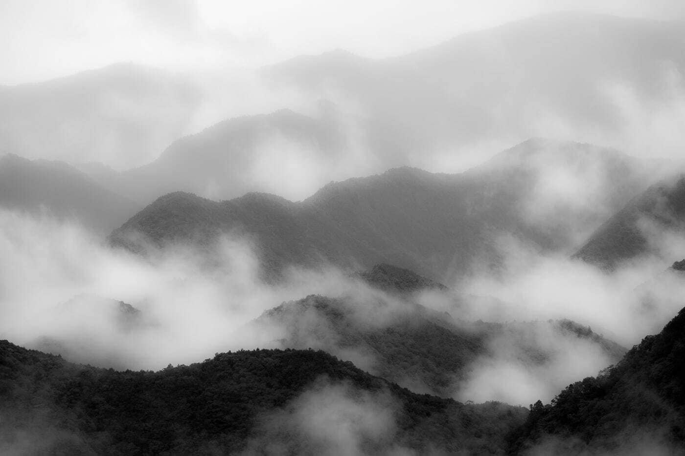
Kontrast und Tonwerte sind sehr eng miteinander verbunden. In der Schwarz-Weiß Fotografie bieten sich sowohl mit einer analogen also auch mit einer digitalen Kamera unzählige Möglichkeiten den Kontrast zu verändern. Dies trifft in der Farbfotografie nur auf den Bereich der Digitalkameras zu. Dabei ist der Kontrast genau genommen eine Technik die auf die Wahrnehmung unseres menschlichen Auges abzielt.
Je stärker der Kontrast, desto härter und spannender nehmen wir die Stimmung auf einem Bild wahr. Ein weicher Kontrast steht dagegen eher für Sanftheit.
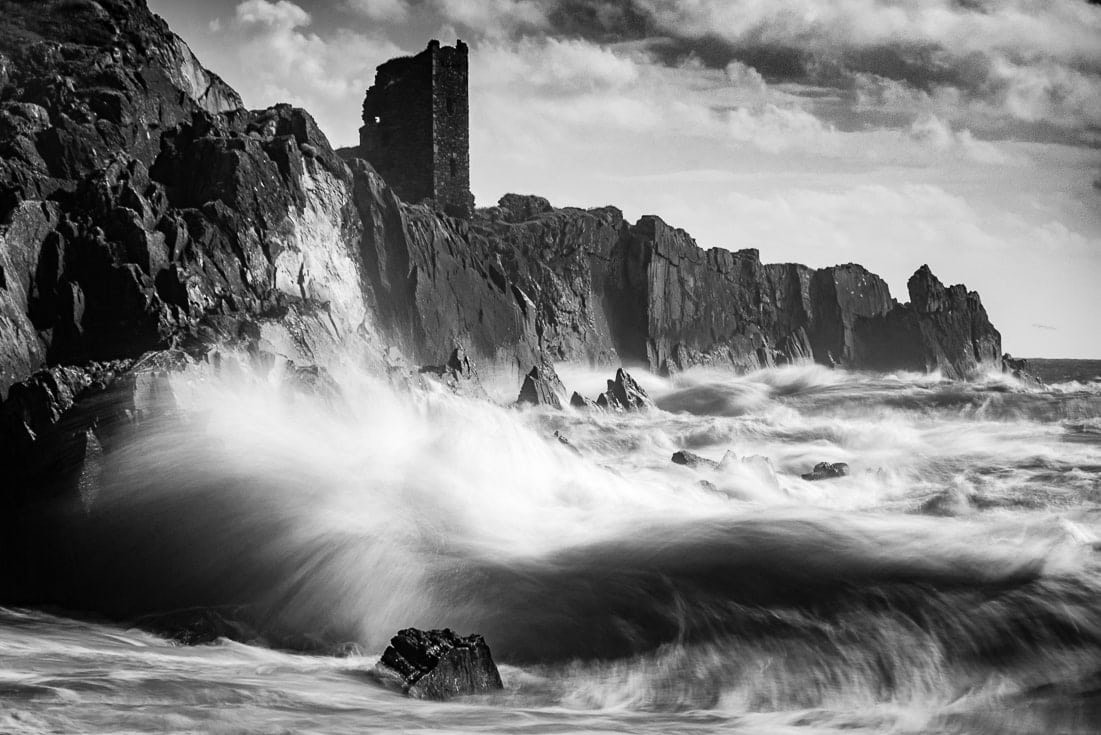 Der starke Kontrast unterstreicht in dieser Fotografie die Dynamik im Motiv.
Der Kontrast hängt vom Bezug der Tonwerte untereinander ab. Ein fließender Übergang zwischen den Mitteltönen bei volle Umfang der Tonwerte, also Rein-Weiß bis Tief-Schwarz, liefert im Ergebnis einen mittleren Kontrast. Helles Grau direkt neben dunklem Grau liefert einen starken Kontrast – und das trotz Verzicht auf die höchsten Tonwerte.
Im allgemeinen Sprachgebrauch werden dunkle Tonwerte meist mit negativen Eigenschaften verbunden, während alles was hell ist positiv angesehen wird. Man spricht auch von Low Key bei dunklen Fotografien und High Key, wenn helle Tonwerte überwiegen.
In der Fotografie bringen dunkle Farbtönehäufig Kraft und Stabilität zum Ausdruck. Ein hoher Kontrast lässt ein Bild dramatisch und strahlend wirken, während ein niedriger Kontrast eher sanfte und ruhige Stimmung vermittelt:
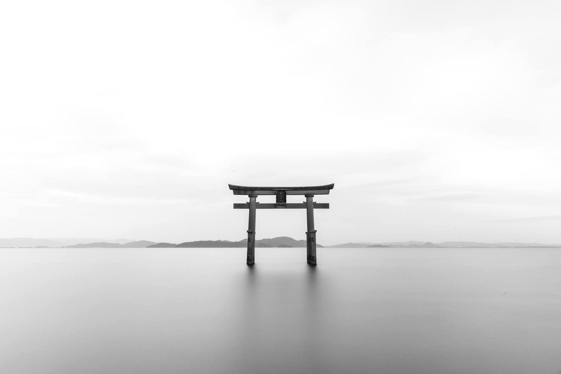 Eine High-Key-Fotografie mit sanftem Kontrast. Das bringt Ruhe und ein Gefühl von Vollkommenheit zum Ausdruck.
[/av_textblock]
[/av_one_full]
[av_hr class=’invisible‘ height=’50‘ shadow=’no-shadow‘ position=’center‘ custom_border=’av-border-thin‘ custom_width=’50px‘ custom_border_color=“ custom_margin_top=’30px‘ custom_margin_bottom=’30px‘ icon_select=’yes‘ custom_icon_color=“ icon=’ue808′ font=’entypo-fontello‘ av_uid=’av-6rta75′ admin_preview_bg=“]
[av_textblock size=“ font_color=“ color=“ av-medium-font-size=“ av-small-font-size=“ av-mini-font-size=“ admin_preview_bg=“ av_uid=’av-2zyf7l‘]
Buchempfehlungen um die Inhalte zu vertiefen:
[/av_textblock]
[av_one_half first min_height=“ vertical_alignment=’av-align-top‘ space=“ margin=’0px‘ margin_sync=’true‘ link=“ linktarget=“ link_hover=“ padding=’0px,0px,0px,0px‘ border=“ border_color=’#efefef‘ radius=’0px‘ radius_sync=’true‘ background=’bg_color‘ background_color=“ background_gradient_color1=“ background_gradient_color2=“ background_gradient_direction=’vertical‘ src=“ attachment=“ attachment_size=“ background_position=’top left‘ background_repeat=’no-repeat‘ animation=“ mobile_breaking=“ mobile_display=“ av_uid=’av-yohh85′]
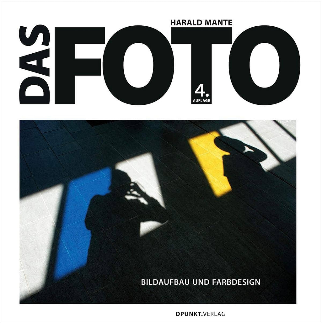
[av_icon_box position=’top‘ icon_style=“ boxed=“ icon=’ue84f‘ font=’entypo-fontello‘ title=’Das Foto: Bildaufbau und Farbdesign‘ link=’manually,https://amzn.to/2ELBccy‘ linktarget=’_blank‘ linkelement=’both‘ font_color=“ custom_title=“ custom_content=“ color=“ custom_bg=“ custom_font=“ custom_border=“ av-medium-font-size-title=“ av-small-font-size-title=“ av-mini-font-size-title=“ av-medium-font-size=“ av-small-font-size=“ av-mini-font-size=“ av_uid=’av-jh7xszb6′ admin_preview_bg=“]
Standardwerk und Klassiker der Fotoliteratur.
[/av_icon_box]
[/av_one_half]
[av_one_half min_height=“ vertical_alignment=’av-align-top‘ space=“ margin=’0px‘ margin_sync=’true‘ row_boxshadow_color=“ row_boxshadow_width=’10‘ link=“ linktarget=“ link_hover=“ padding=’0px‘ padding_sync=’true‘ highlight_size=’1.1′ border=“ border_color=’#efefef‘ radius=’0px‘ radius_sync=’true‘ column_boxshadow_color=“ column_boxshadow_width=’10‘ background=’bg_color‘ background_color=“ background_gradient_color1=“ background_gradient_color2=“ background_gradient_direction=’vertical‘ src=“ attachment=“ attachment_size=“ background_position=’top left‘ background_repeat=’no-repeat‘ animation=“ mobile_breaking=’av-break-at-tablet‘ mobile_display=“ av_uid=’av-yohh85′]
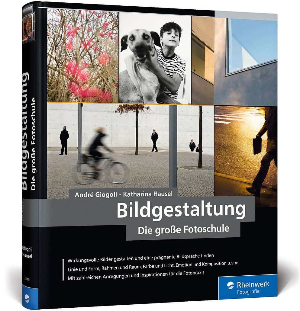
[av_icon_box position=’top‘ icon_style=“ boxed=“ icon=’ue84f‘ font=’entypo-fontello‘ title=’Bildgestaltung. Die große Fotoschule‘ link=’manually,https://amzn.to/2ys7LH0′ linktarget=’_blank‘ linkelement=’both‘ font_color=“ custom_title=“ custom_content=“ color=“ custom_bg=“ custom_font=“ custom_border=“ av-medium-font-size-title=“ av-small-font-size-title=“ av-mini-font-size-title=“ av-medium-font-size=“ av-small-font-size=“ av-mini-font-size=“ av_uid=’av-jh7xszb6′ admin_preview_bg=“]
Ob Linie, Form, Raum, Farbe oder Licht: Alles wird anhand von konkreten Fotos besprochen.
[/av_icon_box]
[/av_one_half]
[av_one_half first min_height=“ vertical_alignment=’av-align-top‘ space=“ margin=’0px‘ margin_sync=’true‘ row_boxshadow_color=“ row_boxshadow_width=’10‘ link=“ linktarget=“ link_hover=“ padding=’0px‘ padding_sync=’true‘ highlight_size=’1.1′ border=“ border_color=’#efefef‘ radius=’0px‘ radius_sync=’true‘ column_boxshadow_color=“ column_boxshadow_width=’10‘ background=’bg_color‘ background_color=“ background_gradient_color1=“ background_gradient_color2=“ background_gradient_direction=’vertical‘ src=“ attachment=“ attachment_size=“ background_position=’top left‘ background_repeat=’no-repeat‘ animation=“ mobile_breaking=’av-break-at-tablet‘ mobile_display=“ av_uid=’av-yohh85′]
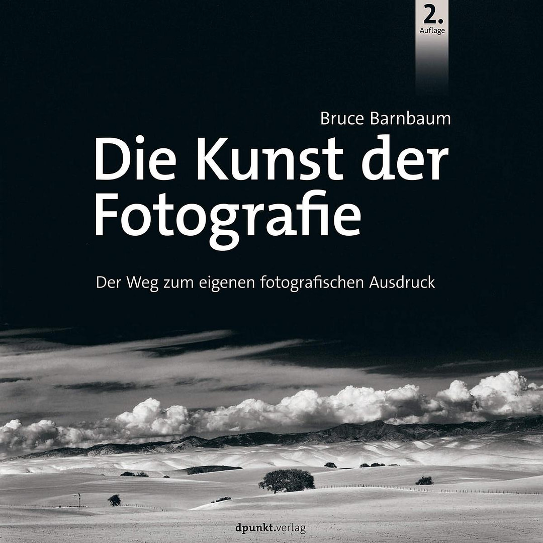
[av_icon_box position=’top‘ icon_style=“ boxed=“ icon=’ue84f‘ font=’entypo-fontello‘ title=’Die Kunst der Fotografie‘ link=’manually,https://amzn.to/2rLc8sI‘ linktarget=’_blank‘ linkelement=’both‘ font_color=“ custom_title=“ custom_content=“ color=“ custom_bg=“ custom_font=“ custom_border=“ av-medium-font-size-title=“ av-small-font-size-title=“ av-mini-font-size-title=“ av-medium-font-size=“ av-small-font-size=“ av-mini-font-size=“ av_uid=’av-jh7xszb6′ custom_class=“ admin_preview_bg=“]
Bruce Barnbaum’s Bücher muss man gelesen haben!
[/av_icon_box]
[/av_one_half][av_hr class=’invisible‘ height=’100′ shadow=’no-shadow‘ position=’center‘ custom_border=’av-border-thin‘ custom_width=’50px‘ custom_border_color=“ custom_margin_top=’30px‘ custom_margin_bottom=’30px‘ icon_select=’yes‘ custom_icon_color=“ icon=’ue808′ font=’entypo-fontello‘ av_uid=’av-6rta75′ admin_preview_bg=“]
[av_textblock size=“ font_color=“ color=“ av-medium-font-size=“ av-small-font-size=“ av-mini-font-size=“ av_uid=’av-13f3op‘ admin_preview_bg=“]
Dein Kursfortschritt:
[av_hr class=’invisible‘ height=’100′ shadow=’no-shadow‘ position=’center‘ custom_border=’av-border-thin‘ custom_width=’50px‘ custom_border_color=“ custom_margin_top=’30px‘ custom_margin_bottom=’30px‘ icon_select=’yes‘ custom_icon_color=“ icon=’ue808′ font=’entypo-fontello‘ av_uid=’av-6rta75′ admin_preview_bg=“]
[av_one_half first min_height=“ vertical_alignment=“ space=“ custom_margin=“ margin=’0px‘ padding=’0px‘ border=“ border_color=“ radius=’0px‘ background_color=“ src=“ background_position=’top left‘ background_repeat=’no-repeat‘ animation=“ mobile_breaking=“ mobile_display=“ av_uid=’av-rlrep‘]
[av_button label=’VORHERIGE LEKTION‘ link=’page,6786′ link_target=“ size=’small‘ position=’center‘ label_display=“ icon_select=’no‘ icon=’ue800′ font=’entypo-fontello‘ color=’theme-color‘ custom_bg=’#444444′ custom_font=’#ffffff‘ av_uid=’av-ixlr5′ admin_preview_bg=“]
[/av_one_half]
[av_one_half min_height=“ vertical_alignment=“ space=“ custom_margin=“ margin=’0px‘ padding=’0px‘ border=“ border_color=“ radius=’0px‘ background_color=“ src=“ background_position=’top left‘ background_repeat=’no-repeat‘ animation=“ mobile_breaking=“ mobile_display=“ av_uid=’av-csyup‘]
[av_button label=’NÄCHSTE LEKTION‘ link=’page,10848′ link_target=“ size=’small‘ position=’center‘ label_display=“ icon_select=’no‘ icon=’ue800′ font=’entypo-fontello‘ color=’theme-color‘ custom_bg=’#444444′ custom_font=’#ffffff‘ av_uid=’av-ayi3t‘ admin_preview_bg=“]
[/av_one_half]